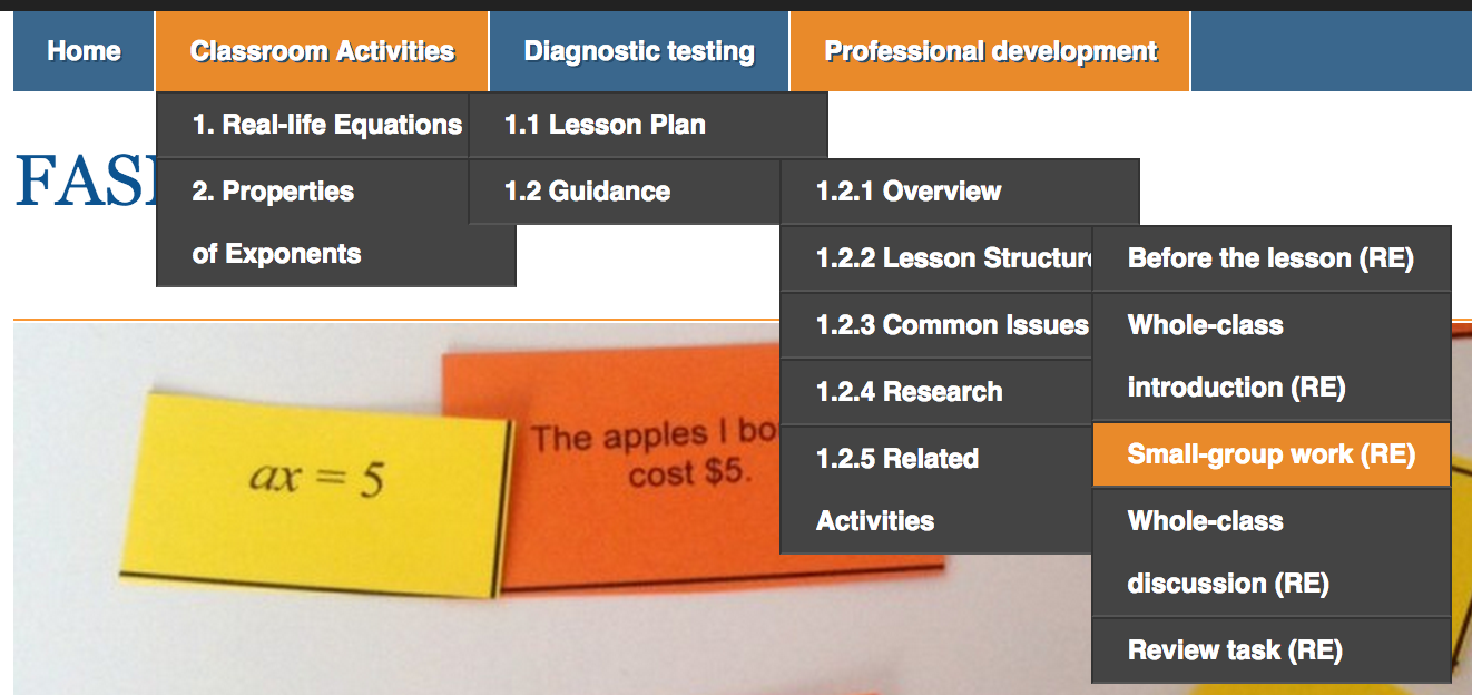
We wanted to make it very easy for teacher to navigate through the online version of the toolkit. We did the following things to facilitate this:
1. We chose a theme which allows both a menu to see the overall structure:
and bread crumbs to see the path one has followed to a particular page:
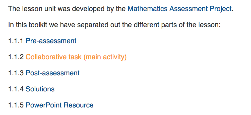
2. We chose a theme which clearly showed where there were links in the text
3. We set up each page so that it is possible to go to its subpages by clicking on links in the text (in this case the next page does NOT open in a new tab)
4. We linked relevant pages to each other, both between the lesson plan and the guidance and from the specific guidance to the more general professional development.

