An on-screen, on-line toolkit has a certain appearance in terms of both the visual design and the language used. It is common for the visual appearance of printed resources to be dictated, or at least influenced by, the publishers of the product. Designers of an online toolkit, however, tend to have more freedom and can experiment with visual designs. In the design of the Mascil toolkit, for example, the authors were constrained by the Mascil branding such as the logo and the colour scheme. However, they were free to choose the font, additional colours and layout.
They also chose to use icons to signal different ways of working (e.g. whole group, pair work), recommended minimum time, downloads and so on. These icons were used in an effort to cut down on too much text, to add immediate signalling for the reader and to make the interface more attractive. Some examples are provided below.
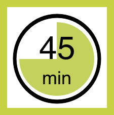 Recommended minimum time 45 minutes

Pair work

Download PowerPoint
We are aware that a wide research base into the visual design of on-screen resources exists. However, we have not yet explored this research.
For all designers of resources for use in schools, there are multiple choices about the language they use. One choice, for example, is the way in which they address their audience. In the MAP lesson guides, the teacher is addressed as ‘you’ and in places is ‘told’ what to do (e.g. ‘Ask students to work in groups of two or three. Give each group some blank paper …’) but in other places the language is less directive (e.g. ‘We suggest that you do not score students’ work). Many suggestions are accompanied by explanations. The editors of the “Aiming Higher’ series addresses their audience (teachers whose first language is likely to not be English) using ‘simple language’ and a ‘respectful’ tone (quotations taken from an interview with Christine Hopkins, co-editor of the series, on 3rd July 2014). Paul Ginnis, in our email conversation, stated that he was aimed for a conversational style, in order to create an informal accessible tone.
Our understanding is that designers address their audience in ways that are implicit within their cultural contexts. We suspect that many of their decisions in this respect are not thoroughly explored and we would welcome so research into the response of audiences to the ways in which they are addressed.